How it All Started
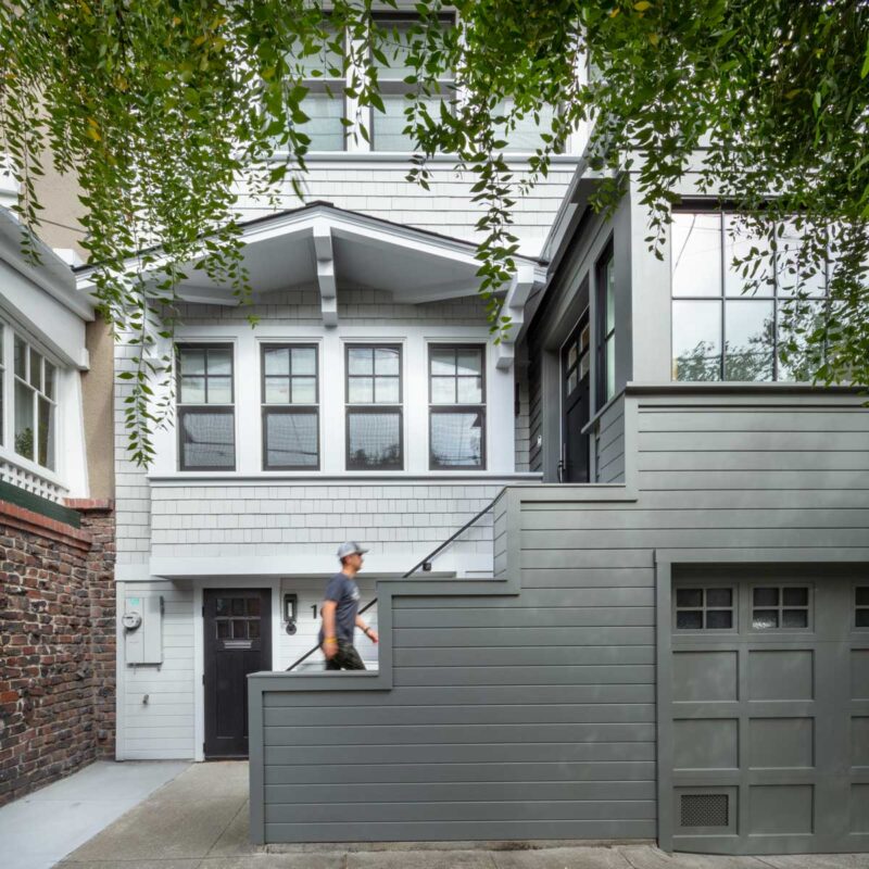
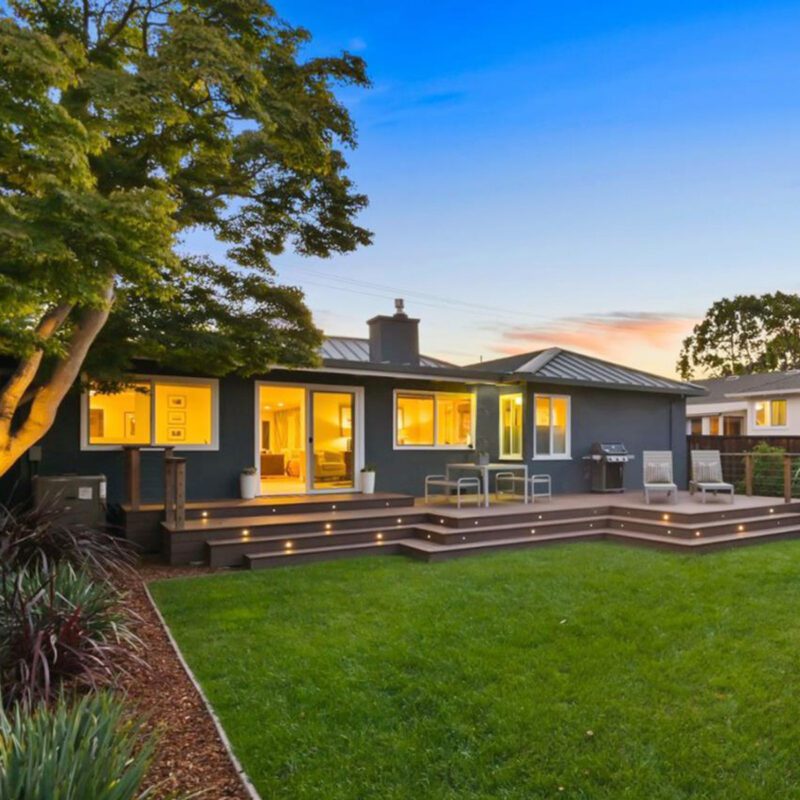
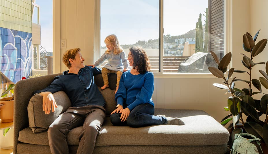
We live in a small 850sf home, which we bought when it was just the two of us. We added a 100-lb. dog and a baby, and the one-bedroom house didn’t quite feel like enough space anymore. But we love our house and wanted to stay in it, so we decided to look for an architect to help us.
On Deciding to Go with Design Build
Initially we weren’t even totally aware of design build as we were researching firms. We learned from family and friends who had gone through remodels that there can be a disconnect between designer and contractor, and that was an important point. Design build spoke to us and worked really well for us. We found a few recommendations and contacted them. We ended up really liking AT6; their aesthetic matched what we were after.
Finding the Sweet Spot Between Budget and Possibilities
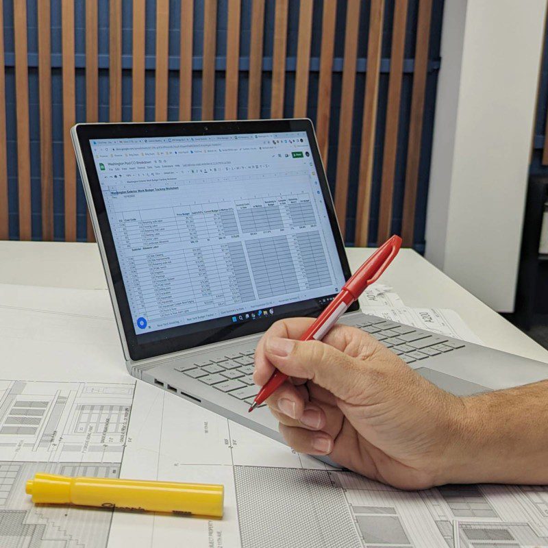
We were looking at using the existing floor plan and maybe going up a level. In the early stages, AT6 helped us find the best course to take by giving us honest feedback on our budget and we quickly realized that a second story wasn’t in our range. They were able to work with our small space and come up with creative solutions that worked perfectly for our lifestyle and for the house. They also looked for opportunities for green construction methods and materials, which aligned with us.
In the early stages, AT6 helped us find the best course to take by giving us honest feedback on our budget and we quickly realized that a second story wasn’t in our range.
Creating Beautiful Small-Space Solutions
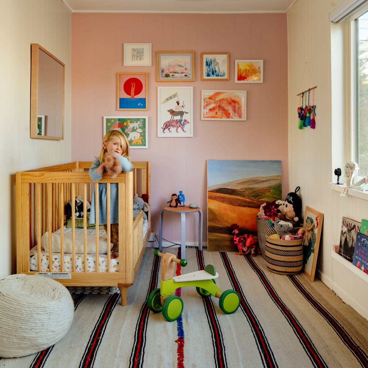
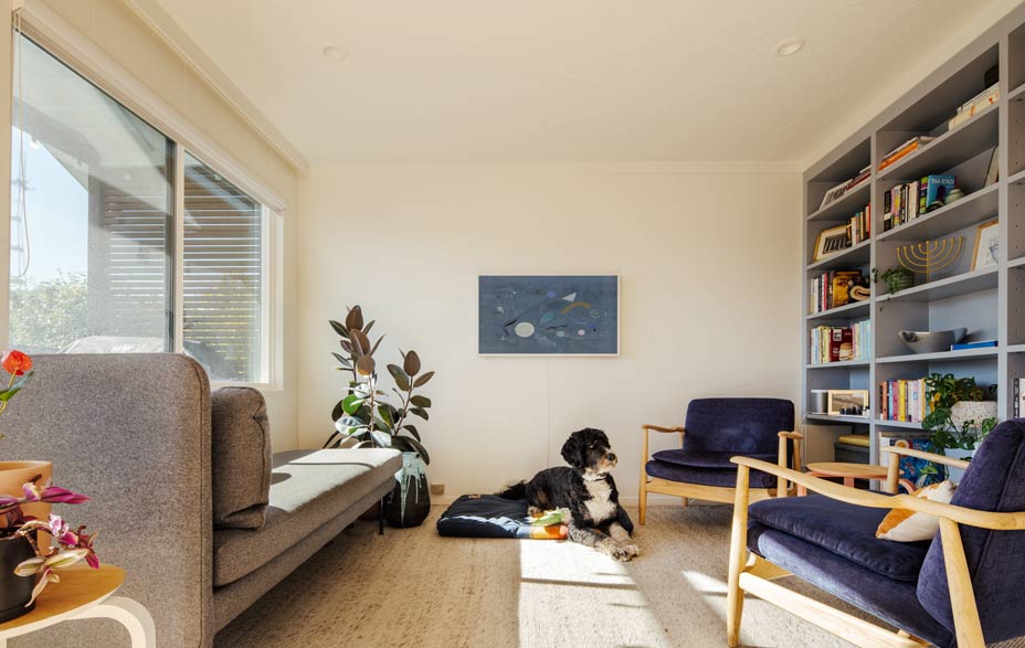
Our primary goal was to create a second bedroom, but we were conscious of the fact that we didn’t have a lot of space and didn’t want to block off light, so we wanted to create a flexible space. The house almost had two living rooms. When you walked in there was a tiny area that fed you into the first of two living rooms and it made a lot of sense to convert the front living room into our daughter’s bedroom.
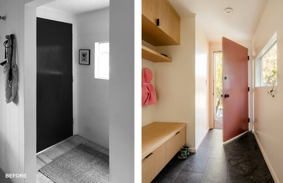
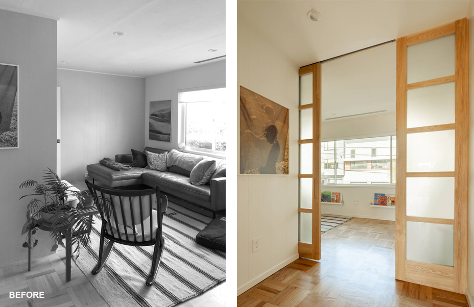
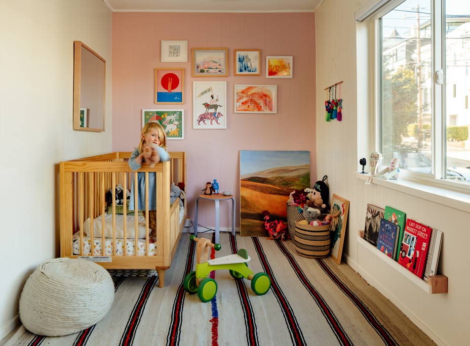
We ended up creating a beautiful, full-height pocket door so this space was flexible. It’s mostly open during the day but we can also close off the room for her. It’s so visually striking that it is a centerpiece for the house. The entry is small, but highly appointed with a built-in bench and cubbies and always feels like a nice way to come home. Even though it’s a small house, the way AT6 did the closets and entryway was very creative—it doesn’t feel like we’re running out of storage.
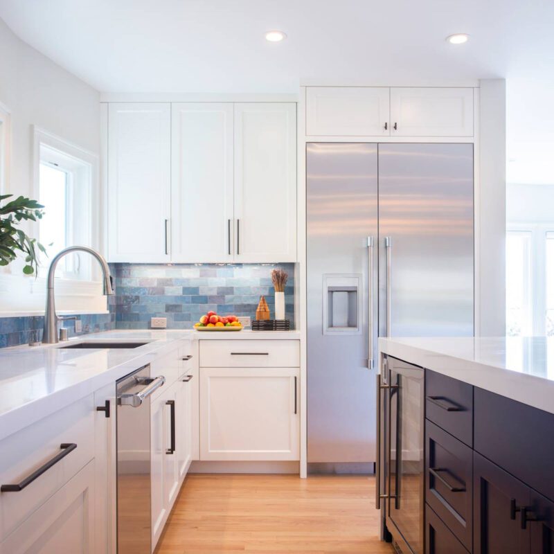
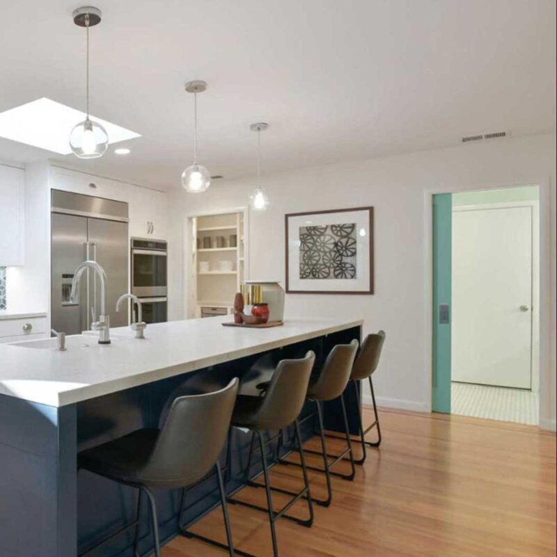
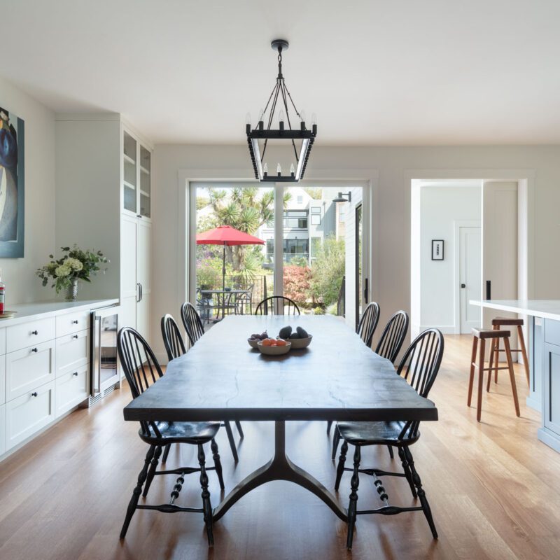
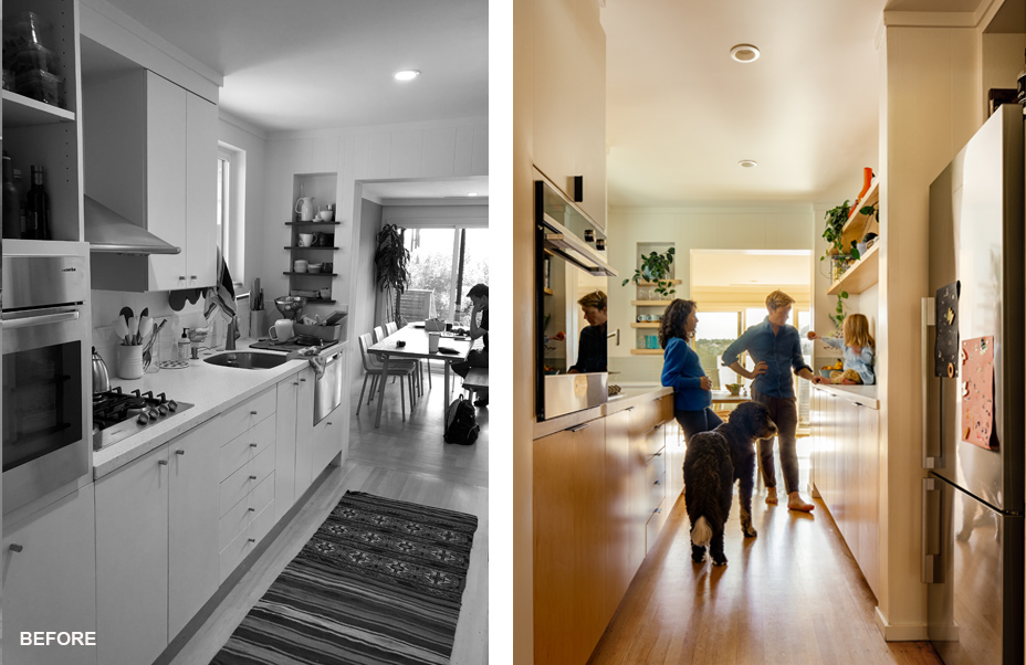
We also had a narrow galley kitchen with everything on one side. AT6 added a second galley space that we love—it’s a small space but feels very airy and gives us a little more room to cook together.
How it All Went
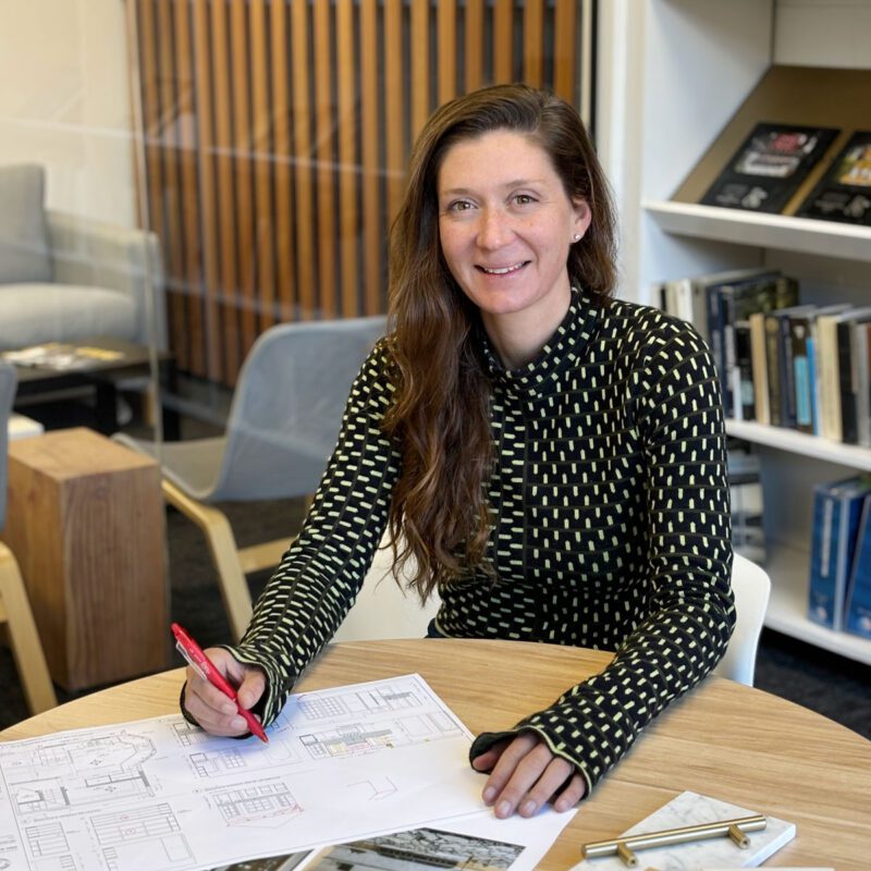
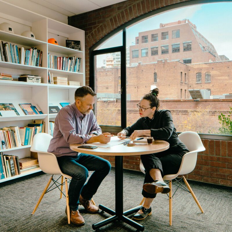
It was a great experience. We really enjoyed the design side of it, working with Camila and Jason, talking about options, sketching things out. We honed in on the options they gave us, and pretty quickly decided what we wanted.
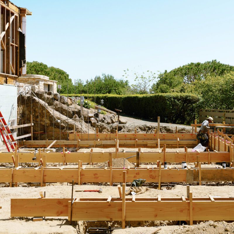
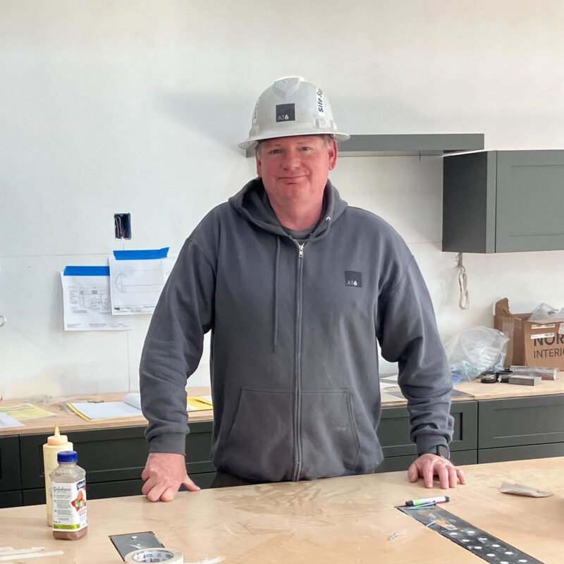
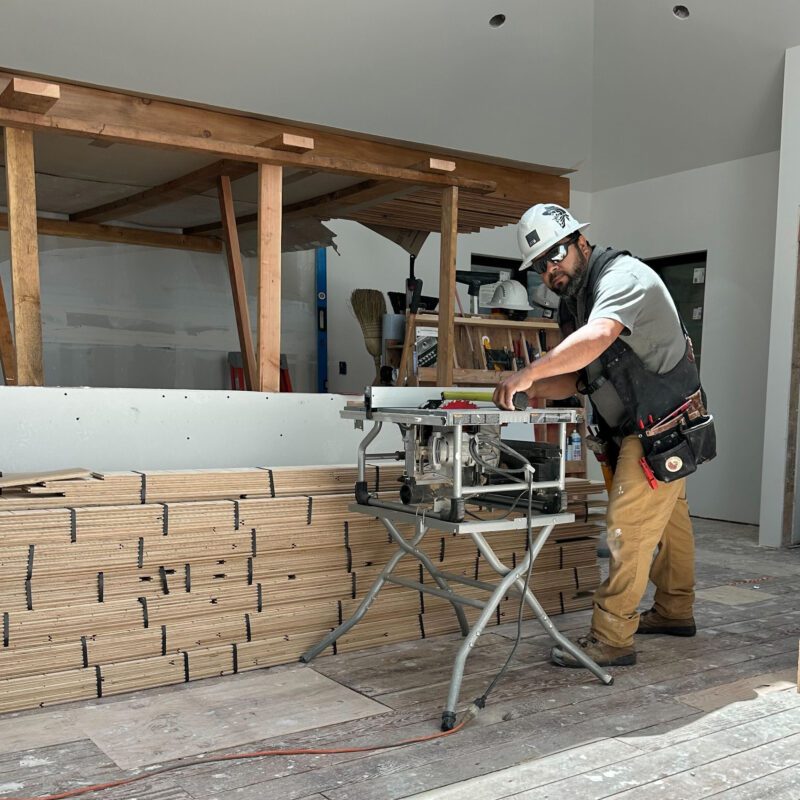
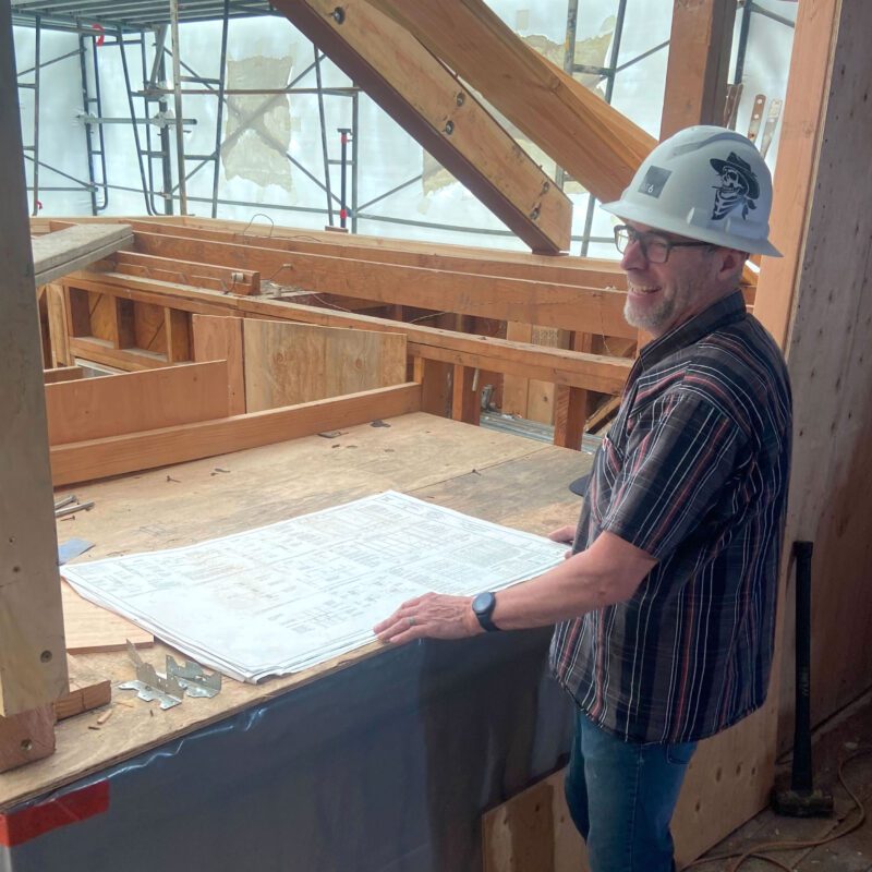
During construction, Anthony, the superintendent, was here every time we stopped by. He was really helpful in walking through what they had done each day, and what issues had come up. The house was always available for us to see. It was incredible how quickly they were able to piece everything together. We are both very into architecture and design and wanted it to be a place we really loved. And it is!
AT6 TEAM CREDITS:
Camila Williams – Lead Designer
KEY PARTNERS:
Photographer – Ethan Gordon
